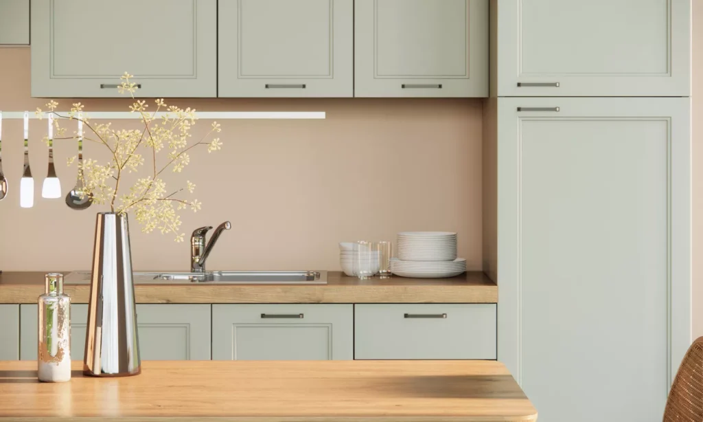
In small kitchens, it’s easy to feel cramped and cluttered. Smart design and clever storage are essential to create a more expansive feel. The right paint color can also contribute to the perception of space. Architectural color consultant Amy Krane suggests considering your personal preferences when choosing a paint color. She emphasizes, “It’s better to accept the spatial limitations of a space and make a beautiful and interesting space—so if you have your heart set on olive green cabinets or navy walls, I say go for it.” However, it’s important to have realistic expectations about how much color can change the impression of a room.
Amy Krane, architectural color consultant at Amy Krane Color and host of the design podcast Let’s Talk Paint Color, offers several tips for choosing a paint color for a small kitchen. First, consider the space, its usage, and the desired look. She advises, “Look at all the other colors in the room,” especially in a kitchen, where finishes like wood, metal, or stone contribute to the overall color scheme. “Consider that color in the scheme, because it counts!” To create a more spacious feel, choose a color that complements the fixture colors, leading to a more uniform and open appearance.
01 of 09 – Pointing by Farrow & Ball. Photo courtesy of Farrow & Ball. This creamy white shade is one of Krane’s favorites for a small kitchen, especially when paired with light, warm gray cabinetry. Skimming Stone, another paint color by Farrow & Ball, makes a great complementary cabinetry hue.
02 of 09 – Misted Green by Benjamin Moore. A pale green-gray, like this soft green from Benjamin Moore, will work for walls or cabinets to soften your color palette. 03 of 09 – Blue Note by Benjamin Moore. You don’t have to miss out on bold colors if you have a small kitchen. This deep blue with a hint of gray, from Benjamin Moore, looks especially beautiful on kitchen cabinets. 04 of 09 – Pigeon by Farrow & Ball. Another soothing, sage hue that works beautifully in small kitchens is Farrow & Ball’s Pigeon. You can use this shade on either the cabinets or the walls. 05 of 09 – Cheviot by Sherwin-Williams. If you want a softer, creamy shade, Sherwin-Williams’ Cheviot shade can help brighten up a small, dark kitchen, and it contrasts beautifully with darker wood cabinets. 06 of 09 – Green Stone by Little Greene. This slightly muted green has a range of shades associated with it, so you can go darker on the cabinets and lighter on the walls—or vice versa. 07 of 09 – White Sesame by Sherwin-Williams. This ivory shade is a pretty neutral that’ll work beautifully with stone countertops and light-colored cabinets—or as a paint for the cabinets themselves. 08 of 09 – Chimichurri by Benjamin Moore. Green and other natural hues have become a hot trend in home design—and if you’re looking for a more saturated color for your kitchen, Benjamin Moore’s Chimichurri might be up your alley. Krane suggests it for cabinets in particular—but it could make a bold choice for the walls as well. 09 of 09 – Van Deusen Blue by Benjamin Moore. If you want a mid-range blue that’s beautiful for a kitchen, Krane recommends this color—especially for painted cabinetry.